Hola amigos bloggeros! ya hace mucho tiempo que no publicaba, asi que hoy vengo a compartir con todos ustedes Iconos sociales que cambian de color al pasar el cursor con CSS, y es que tener iconos como estos a la vista incrementa la posibilidad de que los lectores de vuestro blog puedan seguirte en tus redes sociales
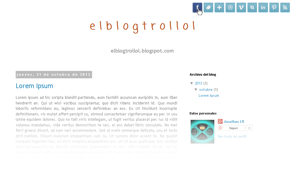
Los iconos que compartiré hoy son de Facebook, Twitter, Google+, Dribble, Vimeo, Skype, LinkedIn, Pinterest y RSS, puedes ver mejor los iconos en este blog de pruebas.
Para añadirlo nos vamos a Plantilla, Editar HTML, buscamos ]]></b:skin> y antes pegamos:
/*-------------------- ICONOS SOCIALES -----------------------*/
#social-icons {
position:relative;
}
ul#social-links {
z-index: 1202;
position: absolute;
margin: 10px 0 0 0px;
right: 0px;
list-style: none;
}
ul#social-links li {  float: left }
ul#social-links li {
float: left;
font-size: 12px;
list-style: none;
width: 32px;
height: 32px;
background: #8dc1d3;
background: -moz-linear-gradient(top, #8dc1d3 0%, #67a7bd 100%);
background: -webkit-gradient(linear, left top, left bottom, color-stop(0%,#8dc1d3), color-stop(100%,#67a7bd));
background: -webkit-linear-gradient(top, #8dc1d3 0%,#67a7bd 100%);
background: -o-linear-gradient(top, #8dc1d3 0%,#67a7bd 100%);
background: -ms-linear-gradient(top, #8dc1d3 0%,#67a7bd 100%);
background: linear-gradient(top, #8dc1d3 0%,#67a7bd 100%);
filter: progid:DXImageTransform.Microsoft.gradient( startColorstr='#8dc1d3', endColorstr='#67a7bd',GradientType=0 );
text-indent: -9999px;
border-radius: 2px;
-moz-border-radius: 2px;
-webkit-border-radius: 2px;
margin: 0 5px 0 0;
box-shadow: 0px 1px 1px #a7dcef,inset 0px 2px 5px #67a7bd;
-moz-box-shadow: 0px 1px 1px #a7dcef,inset 0px 2px 5px #67a7bd;
-webkit-box-shadow: 0px 1px 1px #a7dcef,inset 0px 2px 5px #67a7bd;
}
ul#social-links li  a.facebook {  background: url("http://3.bp.blogspot.com/-yvrJGFGMf6o/UlsiYq6qgoI/AAAAAAAABwQ/oBECfJA1iIg/s1600/facebook+(1).png") 50% 50% no-repeat }
ul#social-links li  a.twitter {  background: url("http://2.bp.blogspot.com/-OgSxpFcf7Jc/UlsilZRoJ0I/AAAAAAAABzc/X8Q7c2K0wuo/s1600/twitter+(1).png") 50% 50% no-repeat }
ul#social-links li  a.google {  background: url("http://4.bp.blogspot.com/-rdTUhluarQ0/UlsiY6LKhbI/AAAAAAAABws/3ERgrgjWo_M/s1600/google.png") 50% 50% no-repeat }
ul#social-links li  a.dribbble {  background: url("http://1.bp.blogspot.com/-jGEI_r2dQ0Q/UlsiYbrgweI/AAAAAAAABwU/Wz3Dt-nPSh0/s1600/dribbble.png") 50% 50% no-repeat }
ul#social-links li  a.vimeo {  background: url("http://2.bp.blogspot.com/-ZqYCRGxDCPw/UlsijszK3LI/AAAAAAAABzI/CR-6qEcZxI4/s1600/vimeo.png") 50% 50% no-repeat }
ul#social-links li  a.skype {  background: url("http://4.bp.blogspot.com/-8EFl3kMJoeM/Ulsif84jV8I/AAAAAAAAByU/gODHuZWmlqM/s1600/skype.png") 50% 50% no-repeat }
ul#social-links li  a.rss {  background: url("http://3.bp.blogspot.com/-38pkO4XSp4A/UlsifNh6YDI/AAAAAAAAByE/iRGCVAWte2w/s1600/rss.png") 50% 50% no-repeat }
ul#social-links li  a.linkedin {  background: url("http://1.bp.blogspot.com/-PxpMYljNM14/UlsiZRkshCI/AAAAAAAABwc/WPZl1mhCr0c/s1600/linkedin.png") 50% 50% no-repeat }
ul#social-links li  a.pinterest {  background: url("http://2.bp.blogspot.com/-tXQUwIW4BS0/UlsibyYR7BI/AAAAAAAABxQ/otP_-OzbdJ8/s1600/pinterest.png") 50% 50% no-repeat }
ul#social-links > li.facebook-link:hover {
float: left;
font-size: 12px;
width: 32px;
height: 32px;
background: #415b92;
background: -moz-linear-gradient(top, #415b92 0%, #33487b 100%);
background: -webkit-gradient(linear, left top, left bottom, color-stop(0%,#415b92), color-stop(100%,#33487b));
background: -webkit-linear-gradient(top, #415b92 0%,#33487b 100%);
background: -o-linear-gradient(top, #415b92 0%,#33487b 100%);
background: -ms-linear-gradient(top, #415b92 0%,#33487b 100%);
background: linear-gradient(top, #415b92 0%,#33487b 100%);
filter: progid:DXImageTransform.Microsoft.gradient( startColorstr='#415b92', endColorstr='#33487b',GradientType=0 );
text-indent: -9999px;
box-shadow: 0px 1px 1px #2a4782,inset 0px 2px 5px #4a67a0;
-moz-box-shadow: 0px 1px 1px #2a4782,inset 0px 2px 5px #4a67a0;
-webkit-box-shadow: 0px 1px 1px #2a4782,inset 0px 2px 5px #4a67a0;
}
ul#social-links > li.twitter-link:hover {
float: left;
font-size: 12px;
width: 32px;
height: 32px;
background: #aad5e3;
background: -moz-linear-gradient(top, #aad5e3 0%, #90c7db 100%);
background: -webkit-gradient(linear, left top, left bottom, color-stop(0%,#aad5e3), color-stop(100%,#90c7db));
background: -webkit-linear-gradient(top, #aad5e3 0%,#90c7db 100%);
background: -o-linear-gradient(top, #aad5e3 0%,#90c7db 100%);
background: -ms-linear-gradient(top, #aad5e3 0%,#90c7db 100%);
background: linear-gradient(top, #aad5e3 0%,#90c7db 100%);
filter: progid:DXImageTransform.Microsoft.gradient( startColorstr='#aad5e3', endColorstr='#90c7db',GradientType=0 );
text-indent: -9999px;
box-shadow: 0px 1px 1px #6cb6cf,inset 0px 2px 5px #7fc9e2;
-moz-box-shadow: 0px 1px 1px #6cb6cf,inset 0px 2px 5px #7fc9e2;
-webkit-box-shadow: 0px 1px 1px #6cb6cf,inset 0px 2px 5px #7fc9e2;
}
ul#social-links > li.google-link:hover {
float: left;
font-size: 12px;
width: 32px;
height: 32px;
background: #f54a35;
background: -moz-linear-gradient(top, #f54a35 0%, #c83e2d 100%);
background: -webkit-gradient(linear, left top, left bottom, color-stop(0%,#f54a35), color-stop(100%,#c83e2d));
background: -webkit-linear-gradient(top, #f54a35 0%,#c83e2d 100%);
background: -o-linear-gradient(top, #f54a35 0%,#c83e2d 100%);
background: -ms-linear-gradient(top, #f54a35 0%,#c83e2d 100%);
background: linear-gradient(top, #f54a35 0%,#c83e2d 100%);
filter: progid:DXImageTransform.Microsoft.gradient( startColorstr='#f54a35', endColorstr='#c83e2d',GradientType=0 );
text-indent: -9999px;
box-shadow: 0px 1px 1px #bf3928,inset 0px 2px 5px #ff6957;
-moz-box-shadow: 0px 1px 1px #bf3928,inset 0px 2px 5px #ff6957;
-webkit-box-shadow: 0px 1px 1px #bf3928,inset 0px 2px 5px #ff6957;
}
ul#social-links > li.facebook-link:hover {
float: left;
font-size: 12px;
width: 32px;
height: 32px;
background: #415b92;
background: -moz-linear-gradient(top, #415b92 0%, #33487b 100%);
background: -webkit-gradient(linear, left top, left bottom, color-stop(0%,#415b92), color-stop(100%,#33487b));
background: -webkit-linear-gradient(top, #415b92 0%,#33487b 100%);
background: -o-linear-gradient(top, #415b92 0%,#33487b 100%);
background: -ms-linear-gradient(top, #415b92 0%,#33487b 100%);
background: linear-gradient(top, #415b92 0%,#33487b 100%);
filter: progid:DXImageTransform.Microsoft.gradient( startColorstr='#415b92', endColorstr='#33487b',GradientType=0 );
text-indent: -9999px;
box-shadow: 0px 1px 1px #2a4782,inset 0px 2px 5px #4a67a0;
-moz-box-shadow: 0px 1px 1px #2a4782,inset 0px 2px 5px #4a67a0;
-webkit-box-shadow: 0px 1px 1px #2a4782,inset 0px 2px 5px #4a67a0;
}
ul#social-links > li.dribbble-link:hover {
float: left;
font-size: 12px;
width: 32px;
height: 32px;
background: #fd83af;
background: -moz-linear-gradient(top, #fd83af 0%, #e46191 100%);
background: -webkit-gradient(linear, left top, left bottom, color-stop(0%,#fd83af), color-stop(100%,#e46191));
background: -webkit-linear-gradient(top, #fd83af 0%,#e46191 100%);
background: -o-linear-gradient(top, #fd83af 0%,#e46191 100%);
background: -ms-linear-gradient(top, #fd83af 0%,#e46191 100%);
background: linear-gradient(top, #fd83af 0%,#e46191 100%);
filter: progid:DXImageTransform.Microsoft.gradient( startColorstr='#fd83af', endColorstr='#e46191',GradientType=0 );
text-indent: -9999px;
box-shadow: 0px 1px 1px #da447c,inset 0px 2px 5px #fc97bb;
-moz-box-shadow: 0px 1px 1px #da447c,inset 0px 2px 5px #fc97bb;
-webkit-box-shadow: 0px 1px 1px #da447c,inset 0px 2px 5px #fc97bb;
}
ul#social-links > li.vimeo-link:hover {
float: left;
font-size: 12px;
width: 32px;
height: 32px;
background: #1ab7ea;
background: -moz-linear-gradient(top, #1ab7ea 0%, #0a9ece 100%);
background: -webkit-gradient(linear, left top, left bottom, color-stop(0%,#1ab7ea), color-stop(100%,#0a9ece));
background: -webkit-linear-gradient(top, #1ab7ea 0%,#0a9ece 100%);
background: -o-linear-gradient(top, #1ab7ea 0%,#0a9ece 100%);
background: -ms-linear-gradient(top, #1ab7ea 0%,#0a9ece 100%);
background: linear-gradient(top, #1ab7ea 0%,#0a9ece 100%);
filter: progid:DXImageTransform.Microsoft.gradient( startColorstr='#1ab7ea', endColorstr='#0a9ece',GradientType=0 );
text-indent: -9999px;
box-shadow: 0px 1px 1px #0b9ac8,inset 0px 2px 5px #31c6f6;
-moz-box-shadow: 0px 1px 1px #0b9ac8,inset 0px 2px 5px #31c6f6;
-webkit-box-shadow: 0px 1px 1px #0b9ac8,inset 0px 2px 5px #31c6f6;
}
ul#social-links > li.skype-link:hover {
float: left;
font-size: 12px;
width: 32px;
height: 32px;
background: #56cbf7;
background: -moz-linear-gradient(top, #56cbf7 0%, #09b2f1 100%);
background: -webkit-gradient(linear, left top, left bottom, color-stop(0%,#56cbf7), color-stop(100%,#09b2f1));
background: -webkit-linear-gradient(top, #56cbf7 0%,#09b2f1 100%);
background: -o-linear-gradient(top, #56cbf7 0%,#09b2f1 100%);
background: -ms-linear-gradient(top, #56cbf7 0%,#09b2f1 100%);
background: linear-gradient(top, #56cbf7 0%,#09b2f1 100%);
filter: progid:DXImageTransform.Microsoft.gradient( startColorstr='#56cbf7', endColorstr='#09b2f1',GradientType=0 );
text-indent: -9999px;
box-shadow: 0px 1px 1px #0281ae,inset 0px 2px 5px #b5ebff;
-moz-box-shadow: 0px 1px 1px #0281ae,inset 0px 2px 5px #b5ebff;
-webkit-box-shadow: 0px 1px 1px #0281ae,inset 0px 2px 5px #b5ebff;
}
ul#social-links li  a {
width: 32px;
height: 32px;
display: block;
}
ul#social-links > li.rss-link:hover {
float: left;
font-size: 12px;
width: 32px;
height: 32px;
background: #ff8500;
background: -moz-linear-gradient(top, #ff8500 0%, #ff6a00 100%);
background: -webkit-gradient(linear, left top, left bottom, color-stop(0%,#ff8500), color-stop(100%,#ff6a00));
background: -webkit-linear-gradient(top, #ff8500 0%,#ff6a00 100%);
background: -o-linear-gradient(top, #ff8500 0%,#ff6a00 100%);
background: -ms-linear-gradient(top, #ff8500 0%,#ff6a00 100%);
background: linear-gradient(top, #ff8500 0%,#ff6a00 100%);
filter: progid:DXImageTransform.Microsoft.gradient( startColorstr='#ff8500', endColorstr='#ff6a00',GradientType=0 );
text-indent: -9999px;
box-shadow: 0px 1px 1px #df5d00,inset 0px 2px 5px #ffb140;
-moz-box-shadow: 0px 1px 1px #df5d00,inset 0px 2px 5px #ffb140;
-webkit-box-shadow: 0px 1px 1px #df5d00,inset 0px 2px 5px #ffb140;
}
ul#social-links > li.linkedin-link:hover {
float: left;
font-size: 12px;
width: 32px;
height: 32px;
background: #007fc5;
background: -moz-linear-gradient(top, #007fc5 0%, #0061b6 100%);
background: -webkit-gradient(linear, left top, left bottom, color-stop(0%,#007fc5), color-stop(100%,#0061b6));
background: -webkit-linear-gradient(top, #007fc5 0%,#0061b6 100%);
background: -o-linear-gradient(top, #007fc5 0%,#0061b6 100%);
background: -ms-linear-gradient(top, #007fc5 0%,#0061b6 100%);
background: linear-gradient(top, #007fc5 0%,#0061b6 100%);
filter: progid:DXImageTransform.Microsoft.gradient( startColorstr='#007fc5', endColorstr='#0061b6',GradientType=0 );
text-indent: -9999px;
box-shadow: 0px 1px 1px #004d90,inset 0px 2px 5px #16a7e8;
-moz-box-shadow: 0px 1px 1px #004d90,inset 0px 2px 5px #16a7e8;
-webkit-box-shadow: 0px 1px 1px #004d90,inset 0px 2px 5px #16a7e8;
}
ul#social-links > li.pinterest-link:hover {
float: left;
font-size: 12px;
width: 32px;
height: 32px;
background: #e63037;
background: -moz-linear-gradient(top, #e63037 0%, #bf1018 100%);
background: -webkit-gradient(linear, left top, left bottom, color-stop(0%,#e63037), color-stop(100%,#bf1018));
background: -webkit-linear-gradient(top, #e63037 0%,#bf1018 100%);
background: -o-linear-gradient(top, #e63037 0%,#bf1018 100%);
background: -ms-linear-gradient(top, #e63037 0%,#bf1018 100%);
background: linear-gradient(top, #e63037 0%,#bf1018 100%);
filter: progid:DXImageTransform.Microsoft.gradient( startColorstr='#e63037', endColorstr='#bf1018',GradientType=0 );
text-indent: -9999px;
box-shadow: 0px 1px 1px #ae0d13,inset 0px 2px 5px #fc545b;
-moz-box-shadow: 0px 1px 1px #ae0d13,inset 0px 2px 5px #fc545b;
-webkit-box-shadow: 0px 1px 1px #ae0d13,inset 0px 2px 5px #fc545b;
}
Ahora buscamos <body> y abajo pegamos:
<!-- inicia #socialIcons --> <div id='social-icons'> <ul id='social-links'> <li class='facebook-link'><a class='facebook' href='http://www.facebook.com/newbthemes' id='social-01' title='Facebook!'>Facebook</a></li> <li class='twitter-link'><a class='twitter' href='http://twitter.com/newbthemes' id='social-02' title='Twitter!'>Twitter</a></li> <li class='google-link'><a class='google' href='#' id='social-03' title='Google+'>Google</a></li> <li class='dribbble-link'><a class='dribbble' href='#' id='social-04' title='Dribble!'>Dribble</a></li> <li class='vimeo-link'><a class='vimeo' href='#' id='social-05' title='Vimeo!'>Vimeo</a></li> <li class='skype-link'><a class='skype' href='#' id='social-06' title='Skype!'>Skype</a></li> <li class='linkedin-link'><a class='linkedin' href='' id='social-07' title=' LinkedIn!'>Linkedin</a></li> <li class='pinterest-link'><a class='pinterest' href='#' id='social-09' title='Pinterest!'>Pinterest</a></li> <li class='rss-link'><a class='rss' expr:href='data:blog.homepageUrl + "feeds/posts/default"' id='social-08' title='RSS!'>RSS Feeds</a></li> </ul> </div> <!-- finaliza #socialIcons -->
Solo cambia lo que esta en rojo por tus redes sociales.
¿No te funciona los iconos?
Quizá es porque usas plantilla hecha por el diseñador, en ese caso busca:
<body expr:class='"loading" + data:blog.mobileClass'>
y abajo pegas el codigo anterior.


5 comentarios
Luis Alfonso · noviembre 1, 2013 a las 1:01 am
excelentes iconos, no los tienes para wordpress?
Jonathan LR · noviembre 1, 2013 a las 2:29 pm
Lo siendo, pero yo domino más Blogger 😉
Ana · noviembre 1, 2013 a las 8:29 pm
gracias me gustan :3
Armando · noviembre 2, 2013 a las 2:24 pm
EXELENTES ICONOS JHONATHAN
Franz Bacapo · diciembre 20, 2013 a las 6:40 pm
🙂